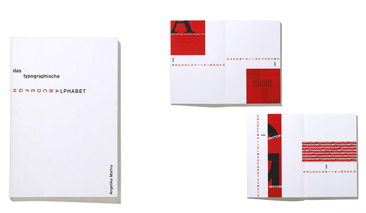
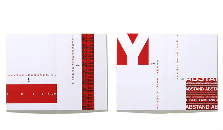
From “A wie Antiqua” to “Z wie Zeilenabstand,” this book visualizes typographic terms in a playful manner. The simple graphic and the dynamic progression are achieved by using black-and-white together with red, moving areas.
Independent project for a typography class with Stefan Fuhrer
at the University of Applied Arts Vienna
Year of origin: 1998